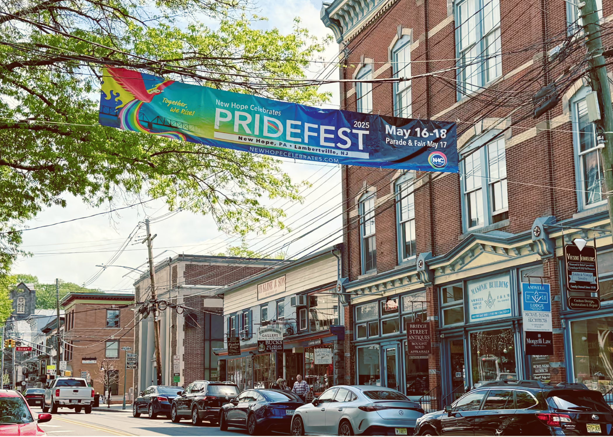
This project didn’t start with a brief — it started with admiration. I’d been following New Hope Celebrates for years and knew I wanted to contribute in some way. So I reached out, more than once, and eventually found myself illustrating and designing the entire PrideFest 2025 campaign.
Over the course of five months, we built something big together — a multi-channel visual identity for 16 events, covering everything from banners and posters to digital ads, social graphics, and signage planted across New Hope, PA and Lambertville, NJ.
Collaborating with New Hope Celebrates, an organization dedicated to uplifting the LGBTQ+ community, added a profound layer of meaning to the work.
Company:
New Hope Celebrates (NHC)
Industry:
Social Events
Services:
Design & Illustration
Date:
2025
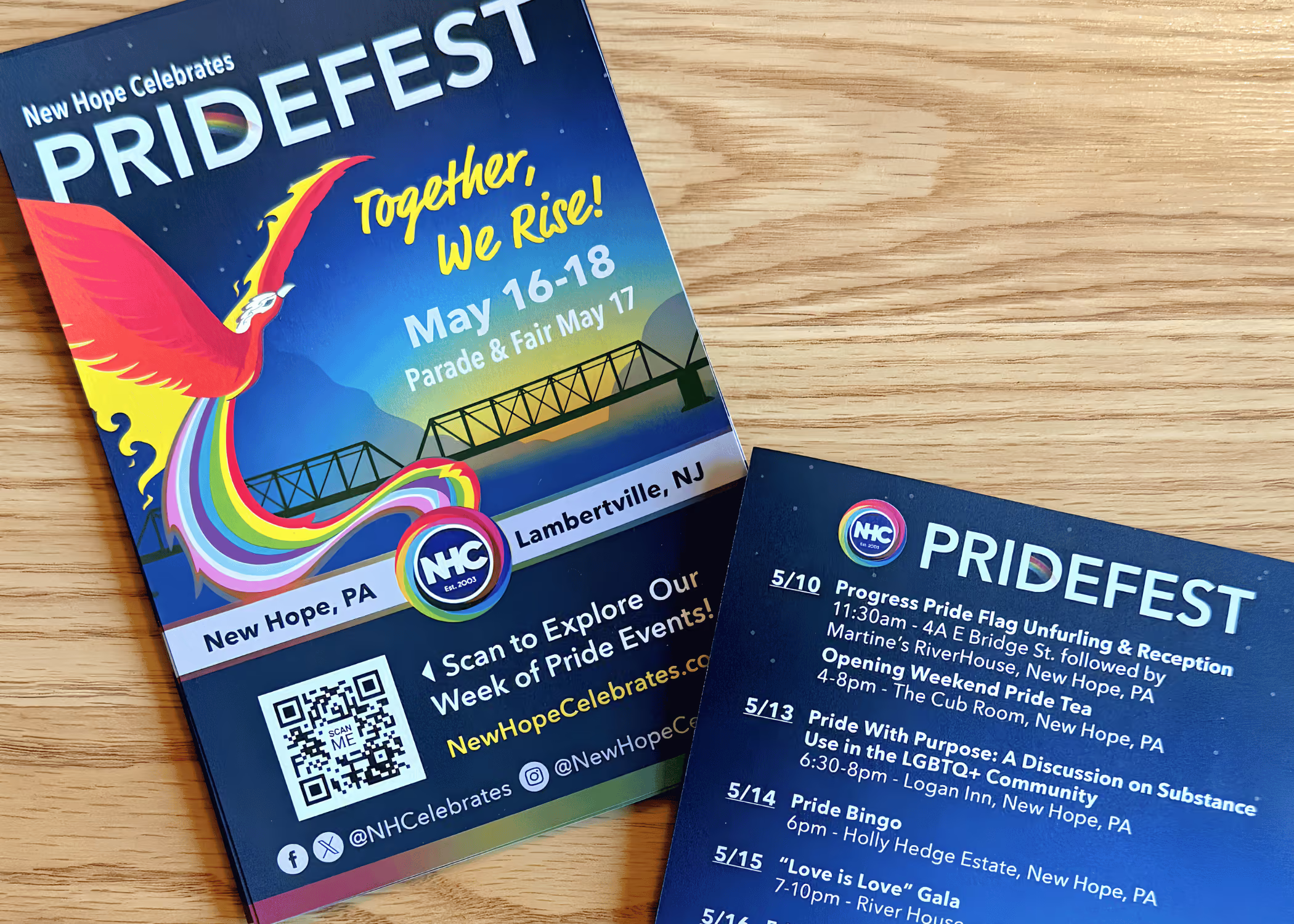
This campaign needed to show up across town and across platforms — from posters, banners, and lawn signs to Instagram, Eventbrite, Facebook, and the main event website. Everything had to feel unified, no matter where it appeared.
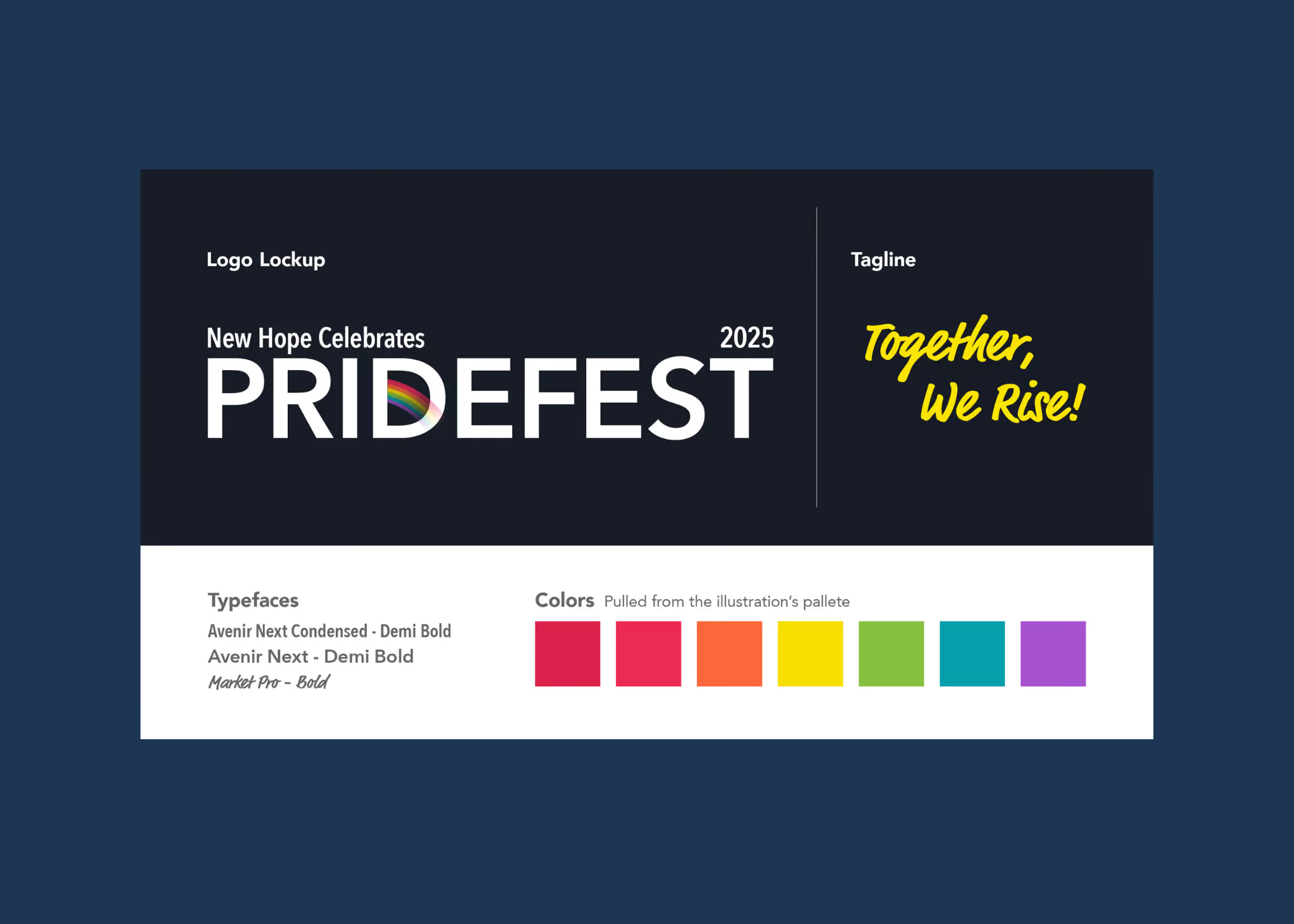
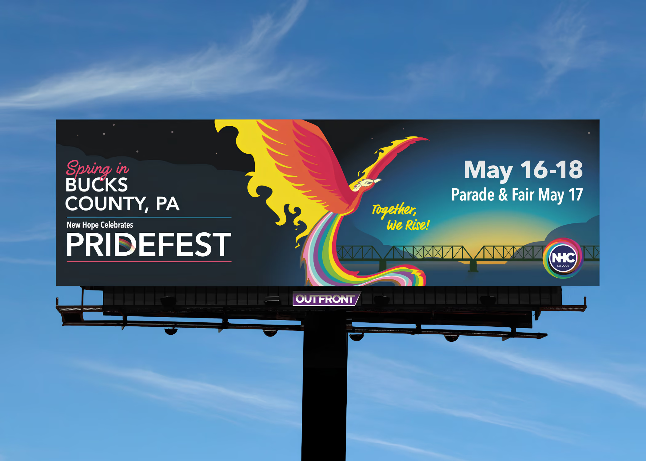
I focused on building a consistent visual system — color, type, layout, illustration — that could scale from a social media thumbnail to a 20-foot banner without losing clarity or tone.
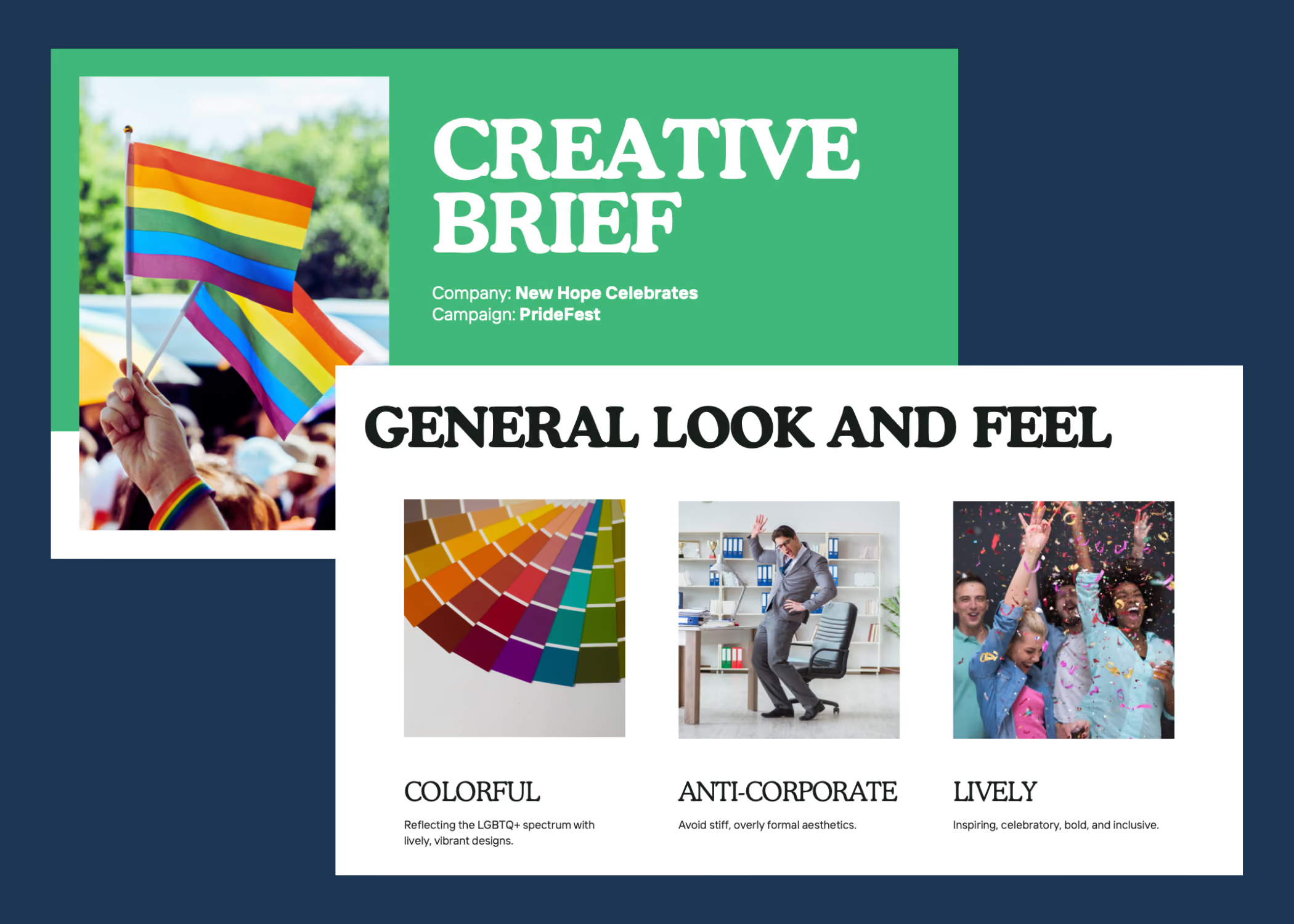
We moved fast — 132.5 hours of work packed into 45 active days, stretched over five months.
That doesn’t count the impromptu texts, questions, or mid-week check-ins. It was a collaborative, fluid process, where I was getting information from stakeholders, printers, and third-party venues, among others. We’d be talking text revisions, getting in fresh logos that needed to be updated, while making print-ready files that went to press immediately.
Every piece of this campaign had a job to do — whether it was grabbing attention, guiding someone to an event, or simply making them feel something.Here are a few favorites:
Street Banner
One of the most prominent pieces in town. Seeing it hung over the main road — colorful, bold, and welcoming — was a full-circle moment. It didn’t just advertise PrideFest. It announced it.
Eventbrite Graphics
For many, these were the first interaction with the campaign. I didn’t just reformat the print work — I redesigned specifically for the screen. Shorter copy. Sharper layout. Better contrast. Designed for thumbs, not sidewalks.
Swag Bag
This one wasn’t tied to a single event — it was built to last. The illustration of the New Hope–Lambertville bridge became a kind of unofficial emblem for the whole season. It’s the kind of piece someone might hang onto long after Pride is over, which is exactly the point.Some of my favorite pieces:
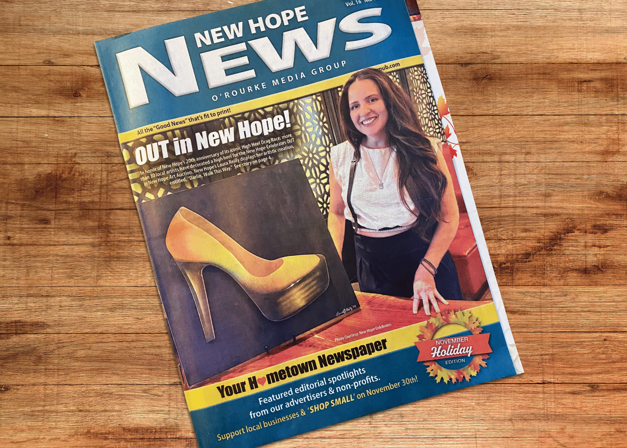
Not everything was linear — and it never is. There were missing logos, late-breaking event additions, edits that came in while I was finalizing print files. I juggled requests from multiple stakeholders, each with different needs and timelines.It wasn’t always smooth, but it was responsive. I built flexibility into the illustrations and designs so they could stretch and adapt when the unexpected happened — which it did, a lot.
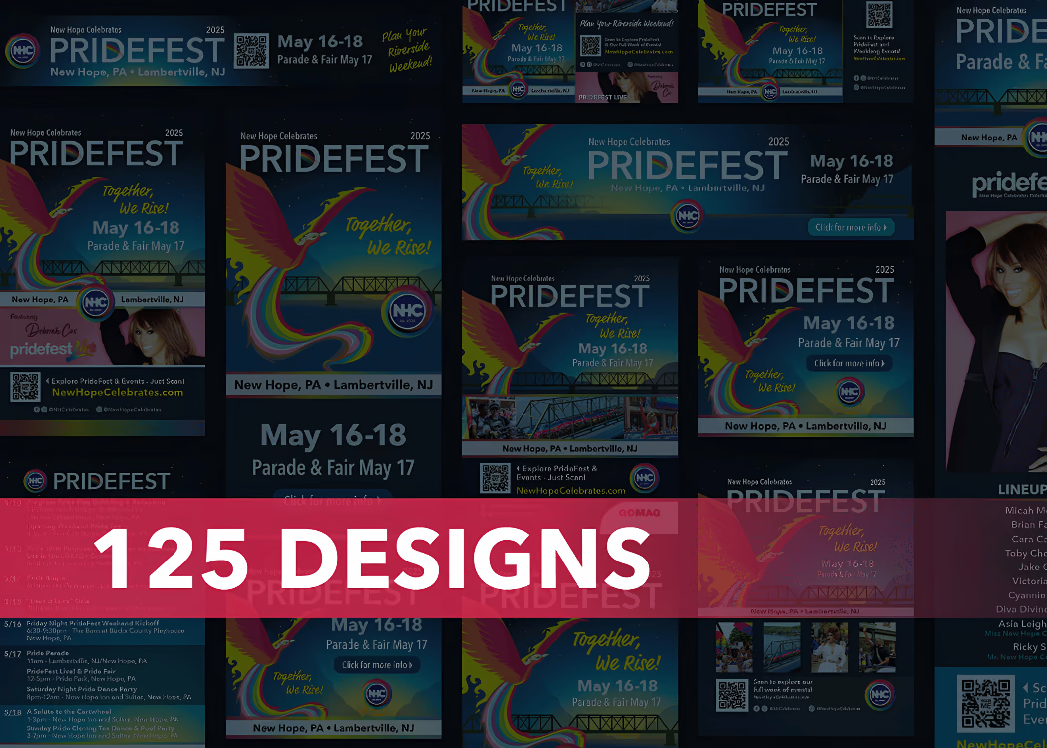
For every printed banner or Instagram post, there was a whole system underneath: folders, spreadsheets, version tracking, asset libraries, and more.
I kept a running document of over 125 deliverables, organizing 725+ pieces of visual content. This part isn’t glamorous, but it’s what keeps a campaign like this from spiraling. It’s how you make sure the parade signage doesn’t clash with the program or the Facebook post doesn’t use last year’s logo. It’s invisible — and essential.
In the span of five months, I created over 125 design pieces for 16 PrideFest events — across print, digital, and everything in between. That included street banners, swag bags, social posts, lawn signs, postcards, posters, and ads for both print and web. Every piece shared one visual system, designed to show up loud and proud.
This campaign had to do a lot at once: inform, unify, guide, promote — and yes, look cool while doing it. It helped an LGBTQ+ nonprofit amplify its voice, made a town feel even more like itself, and reminded me why I love working on community-centered projects with bold creative energy.